Saturday, October 19, 2013

Inventory of Physics Simulations in HTML5/JavaScript

When I discovered last winter how useful JavaScript and the HTML5 canvas element can be for physics simulations, I was astonished that there seemed to be so few examples of such simulations out there. That situation is rapidly changing. Here’s an inventory of the examples I’m aware of at this time.

My own portfolio of three simulations is unchanged, except for a few bells and whistles added to each of them:
Over the summer, with support from the Weber State University Beishline Fellowship, our student Nathaniel Klemm ported five of the simulations that my colleague Farhang Amiri uses in his general education physics course:
(The original versions of these simulations were written by Farhang Amiri and Brad Carroll in Adobe Director, and runnable through the Shockwave browser plugin. These were part of a much larger collection of simulations that they developed in the 1990s. Unfortunately, support for the Shockwave plugin is becoming problematic.)

Andrew Duffy of Boston University has created some simple mechanics simulations:
These would be good examples for a beginning HTML5 developer to learn from, since their code is short and straightforward. (Andrew and I will be giving a workshop on beginning HTML5 simulation development at the 2014 AAPT summer meeting next July.)

Dan Cross of Haverford College has created two extremely elegant simulations that I especially recommend:
John Denker has a simulation that draws hydrogen wavefunction scatter plots:
Dan Styer and Noah Morris of Oberlin College have created a nice demonstration of two-slit interference:
This simulation uses the jQuery UI library for its slider controls, which unfortunately makes them unusable on devices that rely on touch events.

GlowScript is a 3D graphics library built on WebGL, created by David Scherer and Bruce Sherwood who modeled it on their earlier VPython system. GlowScript is accompanied by a web-based development environment that eliminates the need to write HTML, although it can also be used as an ordinary JavaScript library. Some collections of GlowScript examples are posted here:
Unfortunately, the use of WebGL makes GlowScript simulations runnable only under certain browsers. As of this writing they will not run on most mobile devices, although some mobile devices offer partial support.

Francisco Esqembre of the University of Murcia has created a high-end development environment for quickly creating physics simulations, called Easy Java Simulations. Although EJS is a Java program, the new version 5 beta release can output stand-alone HTML5/JavaScript code. More than a dozen examples are now posted here:
The PhET group at Colorado has recently gone public with its first six HTML5 simulations for introductory physics and chemistry:
As you would expect from PhET, these simulations are extremely professional and hence the code, which relies on a vast collection of libraries, is unreadable by mortals.

All of the simulations listed above were created by (or under the supervision of) academic physicists, primarily for the purpose of physics education. But of course the vast majority of graphics-intensive HTML5 development is being done by game developers. Here are a couple of these efforts that contain good physics and are fun to play with:
And that’s my list for now. If any readers out there would like to add to this list, feel free to leave links (noncommercial, please) in the comments.

Tuesday, August 27, 2013

College Tuition Has Outpaced Inflation by 237% Since 1978

Everyone from President Obama on down seems to be talking about how expensive college has become. Amidst all this talk you hear plenty of statistics, usually quoted without much context, by people who have a political agenda. The Democrats want to make college more affordable for the poor, while the Republicans want to help the rich tap into the tuition gravy train. College professors and administrators want to protect their own salaries and budgets. Everyone, it seems, is an expert, and indeed, there is a vast body of literature on the economics of higher education.

So, being a typical curious physicist, I decided to ignore all this literature and try to get the big picture directly from the most obvious place: Consumer Price Index data from the U.S. Bureau of Labor Statistics. The CPI has included a college tuition (and fees) component since 1978, and it’s easy to download the data and compare it to the prices of other goods and services. The results are striking.

To visualize what has happened since 1978, I chose several other CPI data sets and divided each by its 1978 value to get a consistent baseline. Then, to more or less cancel out the effects of overall inflation, I divided each number for a specific CPI category by the “all items” value. Here, without further ado, are the results:


College tuition has risen far more quickly than any other CPI component that I looked at, with the exception of pre-college tuition (which tracks college tuition very closely). You think medical care has gotten more expensive? In the last 35 years the medical care CPI has exceeded overall inflation by only 92%, while college tuition has outpaced inflation by 237%.

Shelter (buying or renting a home) has risen in price only a little faster than the overall CPI during this time. The price of energy has been quite volatile, also rising somewhat on average. Food prices have not quite kept pace with the overall CPI. Virtually all categories of manufactured goods, from apparel to household furnishings to new cars, have become much more affordable than they were in 1978.

In fact, this one graph tells much of the story of the U.S. economy over the last 35 years. Manufactured goods are now cheap because the manufacturing has been either outsourced or automated—and the retailers who sell these goods don’t pay high wages. The money is in professional services like law and finance and medicine and education that can’t easily be outsourced or automated. These professions require a college education, so the demand for college has risen, further driving up its price.

But where is all that tuition money going? That’s an excellent question, which I’ll try to address in a subsequent post.

[Addendum: Of course I’m not the first to produce a graph like the one above. Here’s one that appeared online just yesterday, although it doesn’t show as wide a variety of CPI categories and it doesn’t divide by the overall CPI as I did.]

Wednesday, July 24, 2013

Java vs. JavaScript vs. Python


At last week’s AAPT meeting I presented a poster showing how fun and easy it is to do fluid dynamics simulations using current personal computers and software. These simulations are computationally intensive, so every bit of performance counts. On the other hand, students and hobbyists and other nonexperts like myself rarely have time to write code that will squeeze every last drop of performance out of our machines. Also, it’s hard to share code written in C or Fortran—the languages of professionals—with other nonprofessionals.

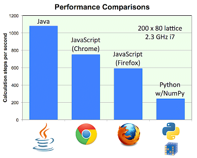
So in recent years I’ve been writing all my physics simulations in Java or Python or JavaScript. And for my poster presentation I decided to clock these languages against each other. I had already written two-dimensional lattice-Boltzmann fluid simulations in all three languages (code posted here), so all I had to do was run them with the same lattice dimensions and measure the number of calculation steps per second. Here are the benchmark results:


This algorithm performs about a hundred basic arithmetic calculations per lattice site per time step, so the Java version, at over 1000 steps per second for 16,000 lattice sites, is performing well over a billion calculations per second on my 2.3 GHz i7 MacBook Pro. I suspect that C or Fortran would run about twice as fast.

All three versions of this simulation include animated graphics, but I was careful to do the graphics in ways that didn’t significantly slow down the computation. In Java, the graphics automatically runs in a separate thread, presumably on a separate processor core.

Since my laptop has four processor cores, I could have sped up the Java version about threefold by parallelizing most of the computation. But that would violate the spirit of this test, which is to see what can be done without getting too fancy with the code. Perhaps Python can also be configured to make better use of my hardware, but I have no clue how to do so (I’m simply using the EPD Free Python installation). I did use NumPy to vectorize everything in Python, since Python loops are glacially slow.

The JavaScript results are shown for only the two fastest browsers, Chrome (version 27) and Firefox (version 22). It seems that Chrome has gotten slightly faster since my earlier tests in March, while Firefox has sped up significantly since then but still hasn’t caught up to Chrome. Both, in any case, offer remarkably good performance at more than half the speed of Java. Safari (6.0.5) is no faster than the previous version, coincidentally about the same speed as Python/NumPy. Opera (12.16) is still far too slow to bother with for this kind of simulation.

Of course, these three languages serve rather different purposes. JavaScript is for web deployment, while Python is for tinkering around on one’s own workstation. Java is fading away as a web platform, but I still like it for personal use when speed and/or interactivity is important.

Update, December 2017: In the four years since I wrote this article, JavaScript execution speed under all browsers has continued to improve. Some typical values that I obtained recently (on the same 2012-vintage MacBook Pro) were 787 steps per second in Chrome, 875 in Firefox, 770 in Opera, and 399 in Safari. The performance isn’t very consistent from one run to the next, and I’m not sure why. I’m also perplexed by Safari’s poor performance, because it does about as well as the other browsers on other computationally intensive physics simulations. The other three browsers are fast enough that it makes sense to increase the number of calculation steps per animation frame from the default 20 up to 30 or even 40. Then Opera typically runs at about 900 steps per second and Chrome and Firefox are a little faster still, rivaling the performance of Java.

Friday, June 7, 2013

Meter That Water!


One of the bewildering ironies of life in Utah is that although we live in the nation’s second driest state, many of us have access to unmetered water for our lawns and other summer irrigation needs. We pay a fixed (per acre) fee on our annual property tax bill, and then use as much or as little of the water as we like, from mid-April through mid-October.

The widespread availability of unmetered secondary water in suburban neighborhoods is apparently unique to Utah. Of course it’s also ironic that this bit of socialism is found in one of the nation’s most Republican states.

Most of our secondary water systems are remnants of the agricultural irrigation systems that were here generations ago, when our suburban neighborhoods were still farms and orchards. I’m not sure why similar systems aren’t found in the suburbs of other Western cities, but it could be simply because our water sources are relatively close to our population centers, making our water infrastructure inherently less expensive. Or it could be due to peculiar laws and practices that grew out of Utah’s early Mormon settlements.

The obvious down-side of unmetered water is that people have no economic incentive to use less of it. So Utahns plant enormous green lawns as if they lived in Kentucky, and then give the grass even more water than it needs. Those who use little or no water end up subsidizing those who waste it.

But the lack of a meter has another disadvantage: It deprives us even of the knowledge of how much water we’re using. As a scientist and educator, I live by the principle that knowledge is inherently beneficial, even when it has no practical consequences.

So, of course, I found a way to measure my secondary water use. First I tried holding my lawn sprinkler over a bucket and measuring how long it took to fill. Then, for convenience, I bought a little $29 meter that screws into a hose line. After making just a couple of measurements I had a very good idea of how many gallons per minute were coming out of the hose, so from then on it was just a matter of timing how long the sprinklers were on and doing a bit of arithmetic.

Here are my results, from last summer’s watering season: I used 1900 gallons outdoors during June, 3200 gallons in July, 2500 in August, and 1600 in September. The total for the season was 9200 gallons, and about 90% of that went onto the patch of buffalo grass in my back yard. The rest was for spot-watering various trees, shrubs, and perennials. I tried to water about twice a week during the hot part of the summer, but sometimes it ended up being less, due to laziness or forgetfulness or being out of town.

For comparison, my indoor water use at home averages about 800 gallons per month.

About half of the city of Ogden—mostly the older neighborhoods—doesn’t have secondary water. Residents in those areas irrigate with metered culinary water, so we know how much they’re using. The amounts vary enormously, with many households using only a few thousand gallons per month but a few dozen customers using hundreds of thousands of gallons each. The use distribution from August 2012 is shown below, with the largest users (about 7% of them) omitted in order to show the rest at a reasonable scale. The median use among these customers during that month was 14,100 gallons, while the average, skewed by the high-use customers, was 20,500 gallons. One customer used a whopping 513,900 gallons.


These customers, of course, have a financial incentive to limit their water use (although thanks to relatively high base rates, the per-gallon fees aren’t very noticeable for those who use only a few thousand gallons per month). We can only presume that the other half of the city, with no such incentive, uses considerably more irrigation water per household.

For their culinary water, customers in Ogden receive a bill that shows not only the amount charged, but also the gallons used. In recent years the city has put additional useful information on the bill, such as the monthly amounts used over the past year (shown as a column graph) and a breakdown of how the water bill was calculated (which I personally lobbied for in early 2012). What’s still missing is any information comparing your usage to that of other city residents.

Along these lines, take eight minutes to watch this fantastic TED lecture. The speaker is Alex Laskey, president of a young company called Opower that helps utilities conserve energy by keeping their customers better informed. As Laskey describes, Opower’s work was motivated by an experiment done a decade ago in southern California, in which researchers found that the way to motivate people to use less electricity was to inform them about the conservation efforts of their neighbors.

Wouldn’t it be fantastic if all our utilities told customers how their usage compares to the average use of their neighbors? We could start with culinary water customers, right here in Ogden.

For our unmetered secondary water, though, it won’t be so easy. The first step is obviously to install meters. That will take a long time, but already the process has begun. Our area’s largest supplier of secondary water now has a pilot program to meter its customers’ usage in a few small neighborhoods. Based on the success of this program, I’m told that they’re hoping to install meters throughout their service area within as little as a decade. At that point they can, if they choose, begin to charge customers based on usage. But even before that controversial step, I suspect they’ll see significant water savings merely from telling customers whether their usage is excessive by local standards.

Friday, March 1, 2013

JavaScript and HTML5 for Physics


Like a number of other physics educators, I’ve invested a fair amount of time and energy over the last decade creating educational software in the form of Java applets.

I love Java for several reasons. It’s a reasonably easy language to learn and use, with logical rules and few exceptions. It gives very good performance, typically within a factor of 2 of native code. And, crucially, for a long time it was installed on nearly everyone’s computers, so most students and others could run my applets immediately, without any huge downloads or configuration hassles.

Unfortunately, that last advantage is now disappearing. For one thing, more and more people are replacing their computers with mobile devices that can’t run Java. Compounding the problem, security concerns have recently prompted many people (and companies) to disable Java on their computers. Some tech pundits have gone so far as to pronounce client-side Java dead.

While it’s likely that Java can be kept on life-support for several more years, its long-term prospects appear grim. So it’s time for us Java applet programmers to abandon this obsolescent technology and find an alternative. But is there one?

Until very recently, I thought the answer was no. Sure, I was aware of the new HTML5 canvas element, which allows drawing directly to the screen via JavaScript, right inside any web page, with no plugins. But this technology has mostly been described as a replacement for Flash, not Java, and I assumed that, like Flash, it would mean sacrificing a lot of performance. I couldn’t imagine that a scripting language could ever approach Java’s speed. Indeed, in an early test of a canvas animation a few years ago, I found the performance to be so poor that computationally intensive physics simulations were unthinkable.

I then avoided thinking about the issue until this winter, when the repeated Java security alerts provided an abrupt wake-up call. Apparently knowledgable geeks all over the internet were telling the public to disable Java, insisting that nobody should ever need to use it again.

So I decided it was time to give JavaScript the HTML5 canvas another try—and I was simply stunned. At least under Chrome, I found that graphics-intensive physics simulations run about half as fast in JavaScript as they do in Java. I can absolutely live with that factor of one-half.

My specific tests were with three simulations that I’ve spent a lot of time with over the years. First I coded a basic Ising model simulation to go with the corresponding section in my Thermal Physics textbook. Then I tried a molecular dynamics simulation, similar to the computational physics project I’ve assigned many times and the applet I wrote a few years ago. Finally, encouraged by these successes, I coded a fluid dynamics simulation using the lattice-Boltzmann algorithm, which I learned with the prodding and help of a student, Cooper Remkes, as he worked on a class project in late 2011.

As the following graphs show, the choice of browser can make a big difference. Each graph shows the relative number of calculation steps per unit time, so higher is better in all cases. I ran the simulations on my new MacBook Pro with a 2.3 GHz i7 processor, and also on one of the Windows 7 desktop PCs in the student computer lab down the hall from my office, with a 2.93 GHz i3 chip. Comparing these two machines to each other wouldn’t be fair at all, and comparisons of the three different simulations wouldn’t be meaningful either, so I’ve normalized each group of results to the highest (fastest) value in the group. The browser versions were Chrome 25, Firefox 19, Safari 6, Opera 12, and Internet Explorer 9; all but the last of these are current, as far as I can tell.  (I tried I.E. 10 on a different Windows machine and found it to be only a little faster than I.E. 9, in comparison to Chrome. I couldn’t easily find a Windows PC with Safari or Opera installed.)


The Ising model benchmark tests a mix of tasks including basic arithmetic, if-else logic, accessing a large two-dimensional array, random number generation, evaluating an exponential function, and drawing to the canvas via context.fillRect. By contrast, the molecular dynamics (MD) and fluid dynamics (FD) simulations heavily emphasize plain old arithmetic. The fluid simulation, however, does more calculation between animation frames, uses much larger arrays, and uses direct pixel manipulation (context.putImageData) to ensure that graphics isn’t a bottleneck. The MD simulation seems to be limited, at least on the fastest platforms, by the targeted animation frame rate.

As you can see, the performance of Opera and I.E. on the MD and FD simulations is a major disappointment. Let’s hope the JavaScript engines in these browsers get some big speed boosts in the near future. Safari and Firefox seem to give acceptable performance in all cases, though neither measures up to Chrome on the demanding FD benchmark. Chrome is the clear all-around winner, although it’s a bit disappointing on the Ising simulation under Windows.

And how does this performance compare to Java? It’s hard to make a comparison that’s completely fair, because of differences in the languages and, especially, the available graphics APIs. But in general, I’ve found that similar simulations in Java run about twice as fast as the best of these JavaScript benchmarks.

The bottom line is that if you choose your browser carefully, JavaScript on a new computer is significantly faster than Java was on the computers we were using during its heyday (a decade ago). And of course, for simulations that don’t require quite as much computational horsepower, JavaScript and canvas can also reach the proliferating swarms of smartphones and tablets. I’m therefore a bit puzzled by the apparent shortage, at least so far, of physics educators who are creating JavaScript/canvas simulations. I’m sure this shortage won’t last much longer.

[Update: See the comments below for further details on the benchmarks, especially for the Ising model simulation.]